Affiliate Disclosure: EntrywayConsoleTable is reader-supported. When you buy through links on this site, we may earn a small commission at no extra cost to you.
About the author � Jessica Chen. Jessica covers interior design and furniture styling for EntrywayConsoleTable.com.
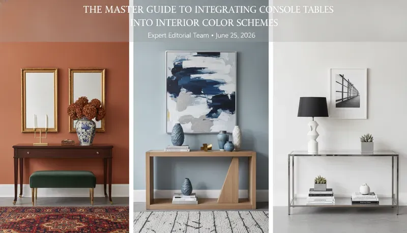
Choosing a console table that works with your room�s color scheme makes a big difference in how polished the space feels. You don’t need to match everything perfectly, but understanding a few color principles helps.
I’ve found that the most important factor is the undertone of the wood or finish. A warm-toned walnut table works differently in a room than a cool-toned grey wash. This guide covers how to make those decisions.
We’ll look at color theory basics, how to pair wood tones with wall colors, and what accessories can bridge the gap between your table and the room.
Table of Contents
- The Fundamentals of Color Theory in Furniture Placement
- The 60-30-10 Rule: Where the Console Fits
- Materiality and Its Impact on Color Perception
- Coordinating with Neutral and Monochromatic Palettes
- Bold Contrasts: Using the Console Table as a Statement Piece
- The Role of Texture and Sheen in Color Integration
- Lighting: The Invisible Variable of Color Schemes
- Styling Accessories: The Final Color Layer
- Room-Specific Integration Strategies
- Data-Driven Selection: Color & Material Comparison Tables
- Frequently Asked Questions (FAQ)
- Final Verdict and Design Recommendations
The Fundamentals of Color Theory in Furniture Placement
To master the art of integration, one must first understand the color wheel. A console table can serve three primary roles in a color scheme: it can be analogous, complementary, or monochromatic.
Analogous Schemes
An analogous approach uses colors that sit next to each other on the color wheel. For example, if your walls are a deep forest green, a console table in a rich oak with yellowish-gold undertones creates a serene, nature-inspired transition. This method is ideal for creating a cohesive, “calm” entryway.
Complementary Schemes
Complementary colors sit opposite each other. A navy blue accent wall paired with a warm, cognac-stained leather-wrapped console table creates high-energy visual tension. This is a technical favorite for “focal point” design.
Monochromatic Layering
Monochromatic design isn’t just about using one color; it�s about varying the values and saturations of a single hue. A slate-grey console against a dove-grey wall, topped with charcoal ceramics, creates a sophisticated, architectural look.
Expert Tip: When working with monochromatic schemes, ensure your console table has a different “sheen” or “texture” than the wall behind it. If the wall is matte, go for a high-gloss or textured wood finish to prevent the furniture from “disappearing” into the wall.
The 60-30-10 Rule: Where the Console Fits
In professional interior design, we use the 60-30-10 rule to balance a room:
- 60% Dominant Color: Usually the walls and large rugs.
- 30% Secondary Color: Upholstery, window treatments, and medium-sized furniture.
- 10% Accent Color: Artwork, pillows, and decorative accessories.
A console table usually falls into the 30% (Secondary) or 10% (Accent) category. If you want the console to be a secondary color, it should harmonize with other furniture in the space. If it’s an accent, you have the freedom to choose a bold, painted finish or an exotic wood species like Zebrawood or Bubinga.
Materiality and Its Impact on Color Perception
The “color” of a console table is often dictated by its material. Natural wood isn’t just “brown”; it has complex undertones.
Wood Species and Their Undertones
| Wood Species | Primary Color | Secondary Undertone | Best For |
|---|---|---|---|
| Walnut | Cool Brown | Purple/Grey | Mid-Century Modern, Minimalist |
| White Oak | Light Tan | Wheat/Neutral | Scandi, Japandi, Coastal |
| Cherry | Warm Red | Amber/Orange | Traditional, Transitional |
| Maple | Cream/White | Pale Yellow | Modern, High-Gloss Finishes |
| Mahogany | Deep Red | Burgundy/Brown | Formal, Classic, Victorian |
Metallic and Composite Finishes
For more industrial or glam looks, the color comes from metals.
- Brass/Gold: Provides a “warm” metallic pop, excellent against navy or emerald green.
- Black Powder-Coated Steel: Provides “visual weight” and works as a neutral anchor in bright, white rooms.
- Acrylic/Glass: These are “colorless” but reflect the colors of the room, making them perfect for small entryways where you want to minimize visual clutter.
Coordinating with Neutral and Monochromatic Palettes
Most modern homes utilize a neutral palette (whites, beiges, greys). The danger here is “flatness.” To integrate a console table into a neutral scheme, you must focus on Contrast Ratios.
If your walls are Alabaster White (a high LRV), a console table in Ebony or Dark Espresso provides a crisp, modern look. Conversely, a white-on-white approach requires varying textures�think a bleached oak console with a heavy grain against a smooth plaster wall.
Read more about choosing the right console table size for your hallway
Bold Contrasts: Using the Console Table as a Statement Piece
Sometimes, you don’t want the console to blend; you want it to scream. This is common in foyers where the console is the first thing a guest sees.
The Power of Jewel Tones
If your entryway is largely neutral, a console table painted in Sapphire Blue, Emerald Green, or Terracotta can act as a stunning anchor.
The “Black Anchor” Technique
In a room filled with pastels or light wood tones, a black console table provides “gravitas.” It grounds the space and gives the eye a place to rest. This is a technical trick used by designers to prevent a room from feeling “floaty” or unanchored.
The Role of Texture and Sheen in Color Integration
Color is not just about hue; it�s about how light interacts with the surface.
- Matte Finishes: Absorb light. They make colors appear darker and more “grounded.” A matte black console is much more subtle than a glossy one.
- High-Gloss/Lacquer: Reflect light. These finishes make colors appear more vibrant and saturated. A red lacquered console table is a bold, high-energy choice.
- Distressed/Reclaimed: These surfaces have multiple “micro-colors” within the grain. They are the easiest to integrate because they usually contain bits of grey, brown, tan, and charcoal, allowing them to “speak” to various elements in the room.
Lighting: The Invisible Variable of Color Schemes
You cannot discuss color without discussing light. The same oak console table will look completely different under different lighting conditions.
Natural Light (The Golden Hour)
East-facing rooms have cool morning light, while West-facing rooms have warm, orange afternoon light. A blue console table will look vibrant in the morning but might turn slightly muddy or “teal” in the warm afternoon sun.
Artificial Light (Kelvin and CRI)
- 2700K (Warm White): Enhances reds, oranges, and yellows. Makes wood tones look richer.
- 4000K (Cool White/Daylight): Enhances blues and greens. Can make warm woods look slightly yellowish.
- CRI (Color Rendering Index): Always look for light fixtures above the console table with a CRI of 90+. This ensures the colors of your table and decor are represented accurately.
Styling Accessories: The Final Color Layer
Integration doesn’t end with the table itself. The accessories you place on top are the “connective tissue” between the furniture and the room.
- The Bridge Technique: If your console is dark wood and your walls are light blue, place a vase on the table that contains both dark wood tones (perhaps a wood base) and light blue (the ceramic body). This “bridges” the two colors visually.
- The Rule of Three: Use three colors on your console. One that matches the table, one that matches the walls, and one accent color (e.g., gold or brass).
Expert Tip: Mirrors placed above a console table are color-neutral, but they reflect the colors of the opposite wall. Be mindful of what is being reflected to ensure it doesn’t clash with your console styling.
Room-Specific Integration Strategies
The Entryway
The entryway is about transition. Use a console table color that hints at the color palette of the rest of the house. If the living room is “Coastal Blue,” use a light-washed wood or white console in the entryway to prepare the visitor.
The Living Room (Behind the Sofa)
When a console is placed behind a sofa, it must integrate with the sofa’s fabric.
- Leather Sofa: Use a metal or stone-top console to provide a contrast in material.
- Fabric Sofa: Use a wood console to bring in warmth and organic texture.
The Hallway
Hallways are often narrow and dark. Avoid dark-colored consoles here unless you have significant artificial lighting. A light grey, white, or glass console is technically superior for maintaining a sense of space.
Check out our guide on entryway console table styling
Data-Driven Selection: Color & Material Comparison Tables
Table 1: Visual Weight by Color and Style
| Style | Color/Finish | Visual Weight | Integration Difficulty |
|---|---|---|---|
| Industrial | Raw Steel/Dark Wood | Heavy | Low (Matches most neutrals) |
| Minimalist | White/Light Oak | Light | Medium (Needs texture) |
| Mid-Century | Walnut/Teak | Medium | High (Requires specific vintage palette) |
| Glam | Gold/Mirrored | Very Light | High (Can look cluttered) |
| Farmhouse | Distressed White/Pine | Medium | Low (Very forgiving) |
Table 2: Complementary Palette Guide
| Wall Color | Recommended Console Finish | Accent Accessory Color |
|---|---|---|
| Navy Blue | Honey Oak / Brass | Cream / White |
| Sage Green | Dark Walnut / Black Steel | Terracotta / Gold |
| Terracotta | Bleached Oak / Charcoal | Turquoise / Slate |
| Charcoal Grey | Light Ash / Chrome | Mustard Yellow / Teal |
| Pure White | Reclaimed Wood / Marble | Black / Emerald Green |
Frequently Asked Questions
H3: Should my console table match my dining table?
Not necessarily. While they should share a common “language” (e.g., both being “modern” or both being “rustic”), matching them exactly can make a home feel like a furniture showroom. Instead, aim for a common undertone. If your dining table is a warm cherry, choose a console with warm undertones, even if it’s a different species.
H3: How do I integrate a black console table without it looking too heavy?
The key is “negative space.” Choose a console with thin legs (like a hairpin or pencil leg) rather than a solid block base. Additionally, use light-colored decor (white marble trays, clear glass vases) on top to lift the visual weight.
H3: Can I mix wood tones on a console table?
Yes, but with caution. The general rule is to keep the “temperature” the same. Don’t mix a cool-toned grey-washed wood with a warm-toned cherry wood. If you keep the undertones (warm, cool, or neutral) consistent, you can mix species successfully.
H3: What is the best color for a small, dark entryway?
A mirrored or glass console table is the technical winner here. However, if you want color, go with a high-LRV (Light Reflectance Value) shade like a soft “Greige” or a light-toned wood like Ash. These colors reflect more light back into the room.
H3: Does the flooring color matter?
Absolutely. Your console table should provide a contrast to the floor. If you have dark espresso hardwood floors, a dark espresso console will disappear. In this case, go at least two shades lighter or darker, or use a rug underneath the console to create a visual “buffer.”
H3: How do I style a colorful console table?
If the table itself is a bold color (e.g., “Electric Blue”), keep the accessories neutral. Use black, white, or metallic items. Let the furniture be the “hero” and the accessories be the “supporting cast.”
Final Verdict and Design Recommendations
Integrating a console table into your color scheme is a sophisticated balancing act between color theory, materiality, and lighting. For the majority of homes, we recommend a “Neutral-Plus” approach: choose a console table in a high-quality natural wood (like White Oak or Walnut) that provides a 20-30% contrast against your wall color.
If you are looking for a timeless look that is easy to update, a mid-toned wood console with matte black hardware offers the most versatility. It anchors the room without dominating it and allows you to change your accent colors (through pillows, rugs, and vases) seasonally without ever needing to replace the furniture.
For those looking to make a bold architectural statement, a monochromatic high-gloss lacquer finish is the gold standard. It speaks to a level of intentionality and design-forward thinking that few other pieces of furniture can match.
Written by: Jonathan Thorne, Professional Interior Designer & Furniture Specialist Fact-checked by: The EntrywayConsoleTable.com Editorial Board
For more technical guides on furniture placement and home aesthetics, visit our Design Blog.